Tag Archives: histogram
Descriptive statistics – Can we plot histogram for categorical variables?
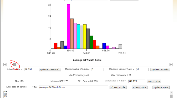
The Shodor Interactivate Histogram WebApp!
Create log10 Histogram with R
An experiment I did during the Udacity course Data Analysis with R related to creating log10 histogram with R.
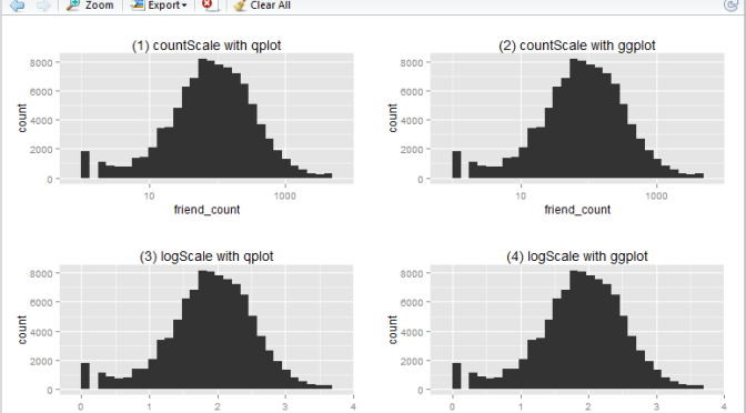
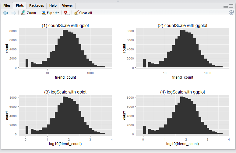
A Udacity supplied Pseudo-Facebook CSV Dataset was used for the purpose of the exercise. It contains interesting variables such as the user’s age, friends count, likes count, etc.) This article is about creating log10 histogram with the aim of generating a normal distributed profile against the variable friend_count.
In this article I will show you how to create a basic log10 historigram in R in 4 different ways:
- show x-axis in
friend_count, using qplot - show x-axis in
friend_count, using ggplot - show x-axis in
log10(friend_count), using qplot - show x-axis in
log10(friend_count), using ggplot
This is what the output will look like:
Before running any codes in R, you need to install the ggplot2 and gridExtra packages (as a one-off). Simply run these lines in RStudio.
install.packages('ggplot2', dependencies = T)
install.packages('gridExtra', dependencies = T)
Now, download the Pseudo-Facebook CSV Dataset to your local drive. Make sure your work directory is set to where the file is stored (using the getwd() and setwd() functions.)
Run the following R script will create the 4 histograms in a 2 by 2 grid-like manner. Note that they show essentially the same thing – just displayed and generated differently.
# Include packages
library(ggplot2)
library(gridExtra)

# log10 Histogram with Scaling Layer scale_x_log10() - so we display x-axis in friend_count

## (1) qplot method
countScale.qplot <- qplot(x = friend_count, data = pf) +
  ggtitle("(1) countScale with qplot") + scale_x_log10()

## (2) ggplot method
countScale.ggplot <- ggplot(aes(x = friend_count), data = pf) +
  geom_histogram() +
  ggtitle("(2) countScale with ggplot") +
  scale_x_log10()

# log10 Histogram without Scaling Layer scale_x_log10() - so we display x-axis in log10(friend_count)

## (3) qplot method
logScale.qplot <- qplot(x = log10(friend_count), data = pf) +
  ggtitle("(3) logScale with qplot")

## (4) ggplot method
logScale.ggplot <- ggplot(aes(x = log10(friend_count)), data = pf) +
  geom_histogram() +
  ggtitle("(4) logScale with ggplot")

# output results in one consolidated plot
grid.arrange(countScale.qplot, countScale.ggplot,
             logScale.qplot, logScale.ggplot,
             ncol = 2)
Now, you ask, why we have 4 ways to plot the same thing? i.e. 2 methods (qplot vs ggplot) by 2 x-axis scales (friend_count vs log10(friend_count)).
-
Regarding
qplotvsggplot: from the many articles and forums that I have come across it seems that qplot is caterred for basic charting (hence simplier), whilst ggplot is catered for more complicated stuff (hence more lengthy syntax). I guess time will tell to find out which one is more suitable in which scenarios, etc. -
Regarding the
friend_countvslog10(friend_count): advantage of usingfriend_countin x-axis is that it is easily understood, at the tradeoff of the numeric scale being evenly distributed (1, 10, 100, 1000, …). Usinglog10(friend_count)does the vice versa: advantage being that the numeric axis scale is evenly distributed (1, 2, 3, 4, …), at the tradeoff that the meaning offriend_count)is slightly diluted (e.g. If I say Joe’s log(friend_count) is 2, what is his friend_count? Well it is simply inverse-log of 2 which is 100. Great. But how about when log(friend_count) is 2.5? You may need a calculator for that: giving you 316.22…). So net net, it depends on who your audience is. Personally, I prefer the log(friend_count) style because of the even numeric scale – I don’t mind doing that extra step of computing friend_count as the inverse-log of log(friend_count).
Which type of histograms (1, 2, 3, or 4) do you usually generate in R (and why?). Have you come across any scenarios when you find that one type is better than the other?