Category Archives: Udacity
swirl – R Programming – Lesson 5 – Missing Values
swirl – R Programming – Lesson 4 – Vectors
swirl – R Programming – Lesson 3 – Sequences of numbers
swirl – R Programming – Lesson 2 – Workspace and Files
swirl – R Programming – Lesson 1 – Basic Building Blocks
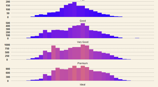
Beautiful Histograms – Hybrid WSJ themed and color-scaled
Creating Boxplots in R – with limits!
Recently I learnt about creating boxplots in R during a Udacity course Data Analysis with R.
Starting off with a sample Pseudo-Facebook CSV Dataset, the aim was to visualize friends-count distribution by gender, using tools such as the R boxplot. The boxplots will enable us to answer questions such as what is the typical distribution profile by gender?, which gender in general have more friend initiations?, are there any improvement opportunities?
There was one major learning relating to the use of applying limits when generating these boxplots, namely the coord_cartesian() method, and the scale_y_continuous() method. These two methods are similar but have very important subtle difference that must not be ignored. I gained this realization from this Udacity Forum.
High level comparison of the two limiting methods
I wish to highlight this very important difference now:
-
the
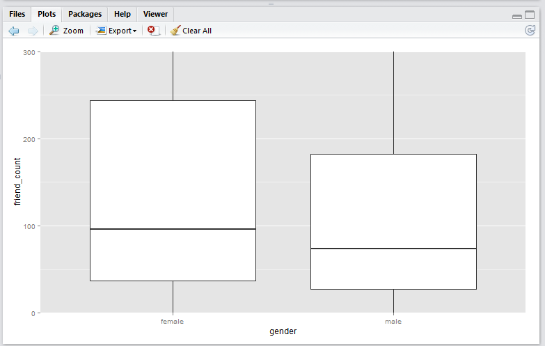
coord_cartesian()method creates boxplots first, then zoom-in to the boxplot graphics. (No data points are removed from the boxplot creations). -
the
scale_y_continuous()method removes data points first, then creates boxplots graphics (Some data points may get removed from the boxplot creations)
Illustration
The first step is to read the Pseudo-Facebook CSV Dataset into a data object via the RStudio.
pf <- read.csv('pseudo_facebook.tsv', sep = '\t')
To create the basic boxplot, we need to load the ggplot2 package and use the qplot utility.
library(ggplot2)

qplot(x = gender,
      y = friend_count,
      data = subset(pf, !is.na(gender)),
      geom = 'boxplot')
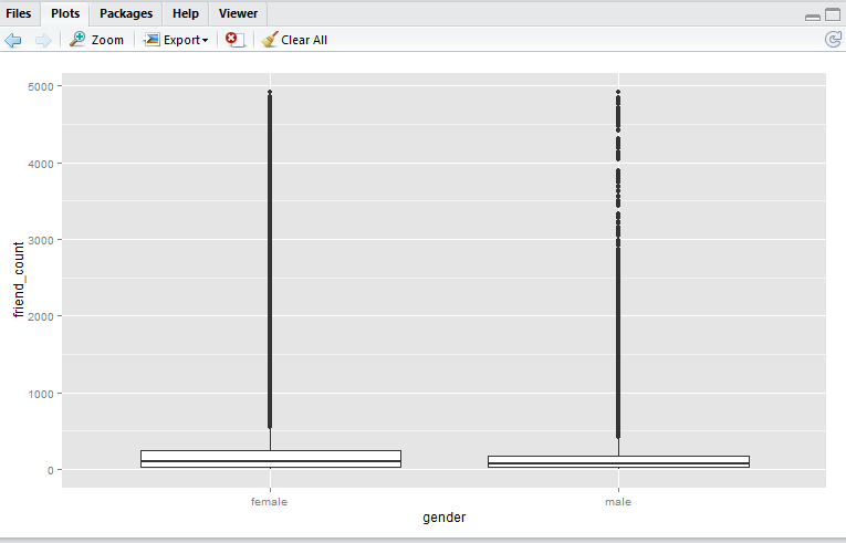
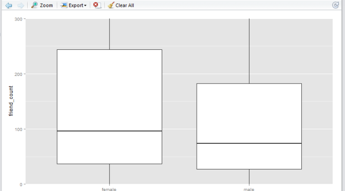
Here we have a boxplot for female, and a boxplot for male. Note that both profiles are fairly long-tail (small distribution of users with abnormaly high friend_count). Now, say we would like to focus on the observations with closer to the box. e.g. friend_count no more than 300.
Here, I would like to show you that coord_cartesian() method will simply zoom-in without altering the boxplots, whereas and the scale_y_continuous() will alter the boxplots completely (as a result of removing data points first, then generate boxplots). Either methods are valid – it depends on whether you wish to keep the (potential) anomaly data in the analysis.
In the following example I shall use 0 as the lower limit, and 300 as the upper limit.
coord_cartesian() method
Script:
qplot(x = gender,
      y = friend_count,
      data = subset(pf, !is.na(gender)),
      geom = 'boxplot') +
  coord_cartesian(ylim = c(0, 300))
Output:
scale_y_continuous() method
Script:
qplot(x = gender,
      y = friend_count,
      data = subset(pf, !is.na(gender)),
      geom = 'boxplot') +
  scale_y_continuous(limits = c(0, 300))
Output:
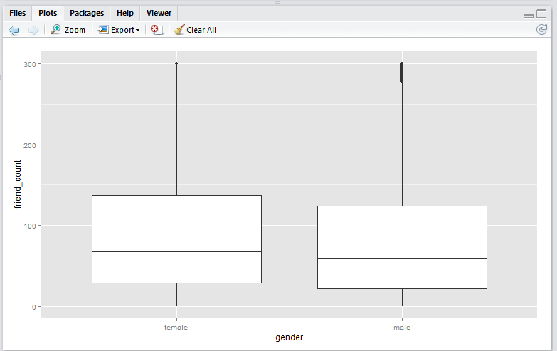
Note that running this script will result in a warning message that looks like this:
Warning message:
Removed 16033 rows containing non-finite values (stat_boxplot).
Observation
-
Note that the
coord_cartesian()method produces a boxplot that is exactly the same as the original boxplot. This is becuase the boxplot is created using the entire set of data points, just like the original. This plot is useful if you wish to analyse all the data points and just want to zoom-in to the data. -
Note that the
scale_y_continuous()method shift the box (25th to 75th percentile) downwards. This is because the all the datapoints above 300 are removed before the boxplot is generated. This plot is useful if you wish to analyse only the data within the limiting range.
Conclusion
In this article I have presented two boxplot methods, namely the coord_cartesian() method, and the scale_y_continuous(). The coord_cartesian() method is suitable if you wish to analyse all of the incoming data before creating the boxplots. The scale_y_continuous() method is suitable if you would like to drop all the data beyond the limiting range prior creating the boxplots.
Discussion
Do you have any interesting experiences relating to creating boxplots with R? Feel free to leave a comment!
Create log10 Histogram with R
An experiment I did during the Udacity course Data Analysis with R related to creating log10 histogram with R.
A Udacity supplied Pseudo-Facebook CSV Dataset was used for the purpose of the exercise. It contains interesting variables such as the user’s age, friends count, likes count, etc.) This article is about creating log10 histogram with the aim of generating a normal distributed profile against the variable friend_count.
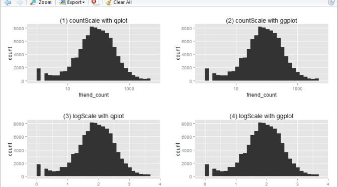
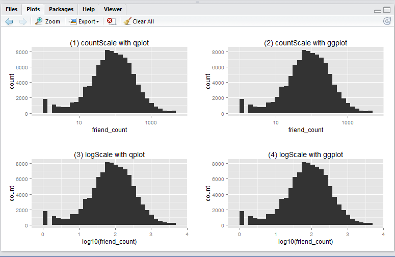
In this article I will show you how to create a basic log10 historigram in R in 4 different ways:
- show x-axis in
friend_count, using qplot - show x-axis in
friend_count, using ggplot - show x-axis in
log10(friend_count), using qplot - show x-axis in
log10(friend_count), using ggplot
This is what the output will look like:
Before running any codes in R, you need to install the ggplot2 and gridExtra packages (as a one-off). Simply run these lines in RStudio.
install.packages('ggplot2', dependencies = T)
install.packages('gridExtra', dependencies = T)
Now, download the Pseudo-Facebook CSV Dataset to your local drive. Make sure your work directory is set to where the file is stored (using the getwd() and setwd() functions.)
Run the following R script will create the 4 histograms in a 2 by 2 grid-like manner. Note that they show essentially the same thing – just displayed and generated differently.
# Include packages
library(ggplot2)
library(gridExtra)

# log10 Histogram with Scaling Layer scale_x_log10() - so we display x-axis in friend_count

## (1) qplot method
countScale.qplot <- qplot(x = friend_count, data = pf) +
  ggtitle("(1) countScale with qplot") + scale_x_log10()

## (2) ggplot method
countScale.ggplot <- ggplot(aes(x = friend_count), data = pf) +
  geom_histogram() +
  ggtitle("(2) countScale with ggplot") +
  scale_x_log10()

# log10 Histogram without Scaling Layer scale_x_log10() - so we display x-axis in log10(friend_count)

## (3) qplot method
logScale.qplot <- qplot(x = log10(friend_count), data = pf) +
  ggtitle("(3) logScale with qplot")

## (4) ggplot method
logScale.ggplot <- ggplot(aes(x = log10(friend_count)), data = pf) +
  geom_histogram() +
  ggtitle("(4) logScale with ggplot")

# output results in one consolidated plot
grid.arrange(countScale.qplot, countScale.ggplot,
             logScale.qplot, logScale.ggplot,
             ncol = 2)
Now, you ask, why we have 4 ways to plot the same thing? i.e. 2 methods (qplot vs ggplot) by 2 x-axis scales (friend_count vs log10(friend_count)).
-
Regarding
qplotvsggplot: from the many articles and forums that I have come across it seems that qplot is caterred for basic charting (hence simplier), whilst ggplot is catered for more complicated stuff (hence more lengthy syntax). I guess time will tell to find out which one is more suitable in which scenarios, etc. -
Regarding the
friend_countvslog10(friend_count): advantage of usingfriend_countin x-axis is that it is easily understood, at the tradeoff of the numeric scale being evenly distributed (1, 10, 100, 1000, …). Usinglog10(friend_count)does the vice versa: advantage being that the numeric axis scale is evenly distributed (1, 2, 3, 4, …), at the tradeoff that the meaning offriend_count)is slightly diluted (e.g. If I say Joe’s log(friend_count) is 2, what is his friend_count? Well it is simply inverse-log of 2 which is 100. Great. But how about when log(friend_count) is 2.5? You may need a calculator for that: giving you 316.22…). So net net, it depends on who your audience is. Personally, I prefer the log(friend_count) style because of the even numeric scale – I don’t mind doing that extra step of computing friend_count as the inverse-log of log(friend_count).
Which type of histograms (1, 2, 3, or 4) do you usually generate in R (and why?). Have you come across any scenarios when you find that one type is better than the other?
Use Google Trend to compare Programming Language Interest
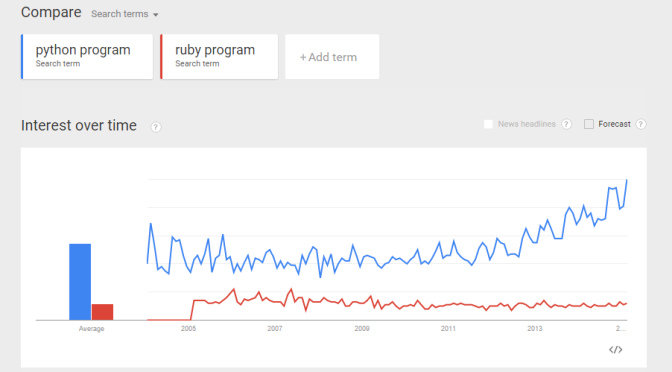
From a recent exercise in which my objective was to use Google Trend Explore to compare interests between Python and Ruby (programming languages) over the past few years. A question arised – python could be the snake, monty python, the programming language, etc. Likewise, ruby could be a type of gems, a programming language, etc. If I did a trend comparison between python and ruby, I might run into problem such as comparing trend interest between a python the snake, and ruby the programming language (instead of comparing a programming language to another). How do I gain confidence that when I do a trend of Python vs Ruby, I am indeed comparing apple-to-apple? (programming language to programming language?). Here is my approach: Compare the trends between “python language”, “python program”, and “python code”. I want to gain some confidence that all three mean more or less the same thing. 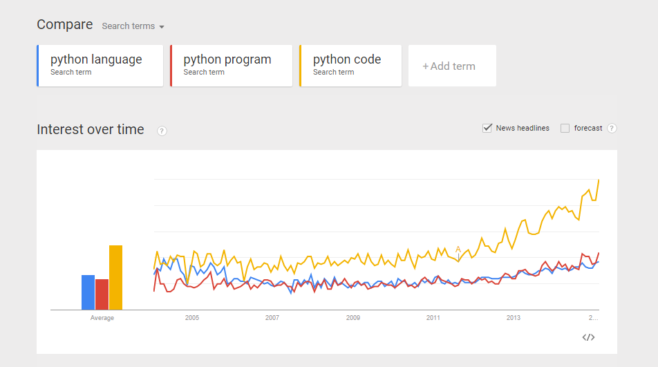 Do the same for Ruby. Compare the trends between “ruby language”, “ruby program”, and “ruby code”.
 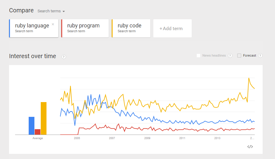 From the comparisons above, I believe I can make more or less “apple-to-apple” comparison between python and ruby (as programming languages).
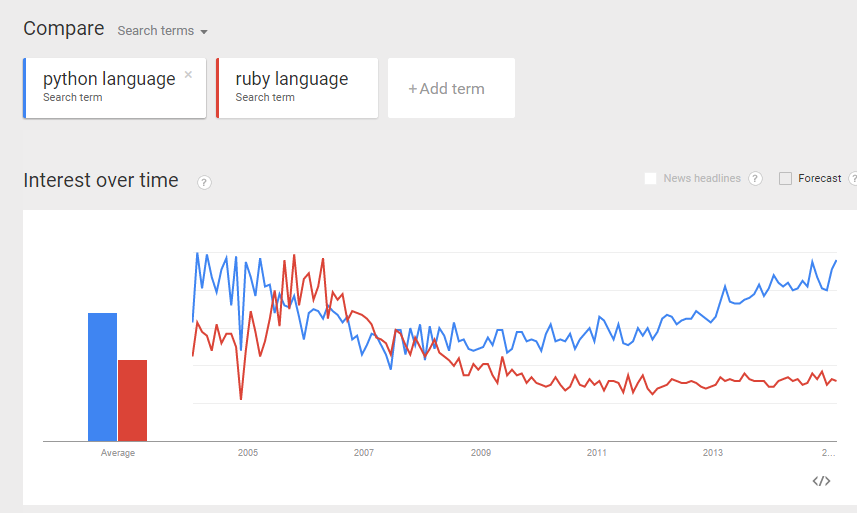

 Do some “eye-ball” comparisons between the above “python language” and “ruby language” trends, and make some fairly reasonable conclusion. I was actually hoping to see the above 3 trend comparisons to be more or less the same. Reality turns out they differ quite a bit. I guess more work is required to digest the data and make sense of it. Can you suggest a better way to compare interest of two programming languages? (e.g. Python and Ruby)? And what would be your conclusion? Would love to hear your thoughts.
